1. Denver Broncos
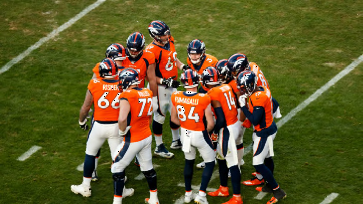
Like many teams in the late 1990s to early 2000s that changed uniforms, the Denver Broncos were victims of the need to look “modern”. In the same way the Arizona Cardinals did, they went a little overboard with their uniforms as they decided to place a huge stripe from the armpit all that way down to the leg.
Originally in 1997, it was a dark blue jersey with an orange stripe and then they had a blue stripe on the white. In 2004, they started to use the orange jersey with a blue stripe and while it looks better, it’s still not a good look and feels outdated.
What’s worse, is the logo. The Broncos had a bucking bronco for years inside of a letter D on their helmet and there was nothing wrong with that at all. However, they now had a robotic looking horse that hasn’t been as well received.
Not only this, but the shade of orange and blue were better back in the day when John Elway was in his prime. Hopefully, with Elway now in charge of football operations, he can get into someone’s ear and convince them to use something similar to what he got to wear.
Again, updating the look is fine but they strayed way too far from what was looking and whenever they do wear a throwback, fans let them know it looks better.
