NFC East uniform changes
Dallas Cowboys: Fix Home Colors
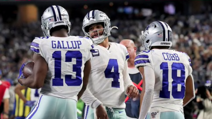
The story behind the Cowboys’ home jerseys is interesting. They originally chose to wear white at home to help protect their players from the heat. (This was before Jerry World.) Over the years, the colors have evolved slightly until Nike’s overhaul in 2012 made it especially clear: Dallas’ home uniforms look incredibly weird.
If a random expansion team made these their uniforms, they’d get ridiculed. The only reason Dallas gets a pass is that they’re “iconic.” It’s inconsistent with the team’s logo, even if “royal blue” is an official team color. Just change the blue and weird teal-silver hybrid to the team’s “navy blue” and “metallic silver”.

Philadelphia Eagles: Redo Number Outlines
The font seems a bit too funky for the uniform, but they match the team’s brand, and this isn’t an article about changing brands (sort of). Instead, I’ll take a page from the Bengals suggestion box and propose a slimmer, centralized outline for the numbers. Maybe that would make the numbers look less like bad gothic bubble letters.

New York Giants: Get Rid of Gray
According to the team website, Giants’ team colors are red, white and blue. They’re not red, white, blue and gray. I get that the team wore gray pants and gray facemasks in the 1960s, but it should’ve stayed in that decade.
Replace the color with white. It’s not like it’s an outlandish request. They wear white facemasks on their Color Rush/throwbacks and they wear white pants with their other jerseys. New York also looks way better without the gray.

Washington Redskins: Make Helmet Stripe Thinner
The Redskins have nice, simple uniforms. But I noticed something that I can’t unsee. The white-gold-white stripe on Washington’s helmet takes up too much space on the helmet. By thinning it out a bit, it could make more room to enlarge the team’s detailed logo. Either that or just overhaul the outdated logo completely.
