The Green Bay Packers unveiled a new 1950s throwback uniform that they’ll wear in the 2021 season and the franchise nailed the execution.
For a historic NFL franchise like the Green Bay Packers, it’s no surprise that they’ve worn throwback uniforms before. It is a bit surprising, though, how bad they’ve been up to this point. The two navy and gold throwback jerseys — one with the brownish-gold shoulder pads and the other with the front number inside a brownish-gold circle — were simply eyesores.
That’s not the case with the 1950s classic throwback uniforms the Packers dropped on Thursday, though.
Green Bay dropped a hype video on Thursday morning announcing the arrival of the new throwback uniforms, showing numerous players in the new look and giving fans a look at uniforms that are a clear homage to the 1950s they are supposed to be honoring while also having several sleek and modern touches to them:
https://twitter.com/packers/status/1428340975605268485
They also gave fans a still look at several players, such as David Bakhtiari, Jaire Alexander and Aaron Jones, in the new throwback uniforms:
https://twitter.com/packers/status/1428344930188021760
The Packers also announced that they’ll break out the 1950s classic uniforms for the first time on Oct. 24 when they face the Washington Football Team at Lambeau Field in Week 7.
There’s no other way to say it beyond these new throwbacks are absolute fire, legitimately some of the best new classic uniform looks we’ve seen in a long time. So to appreciate them, here are three things that really stand out about the new look.
3 Details that make the new Green Bay Packers throwback uniforms elite
3. These Green Bay throwback uniforms actually make the team look like the Packers
One of the biggest issues I had with the 1929 and 1940s throwback uniforms that the franchise wore at various parts of the 1990s, 2000s and 2010s was the fact that they didn’t look like the Packers. Since the 1950s, green and gold have been the staple colors of the franchise. So it always looked jarring in an unwelcomed way to see them with navy and a different shade of gold.
In fact, it was in 1950 when the organization adopted green into the color scheme after the navy-gold look because, well, it’s in the name of the city they play in. So to have a throwback look that incorporates the colors that have become iconic and synonymous with Green Bay is the right look. And let’s also quickly appreciate the vibrant, popping colors on these new duds as well.
2. Striped sleeves are a modern take on the classic look
The modern Packers uniforms have maintained the also-iconic striped sleeve look that Green Bay has worn for years with two yellow stripes separated by a white stripe with green outline in the middle to tie in the helmet stripe. But with the solid yellow helmets on these throwbacks, they have done away with the center stripe and gone back to the two yellow stripes.
Back in the 1950s, the sleeves on NFL jerseys were longer, stretching down to the elbows. And the Pack had the stripes at the end of the sleeves. Given that most uniforms now barely cover the shoulder pads, the stripes have been moved higher but it’s still a perfect look that brings the look together while paying tribute to the 1950s uniforms as intended.
1. No iconic “G” on the helmet makes them stand out
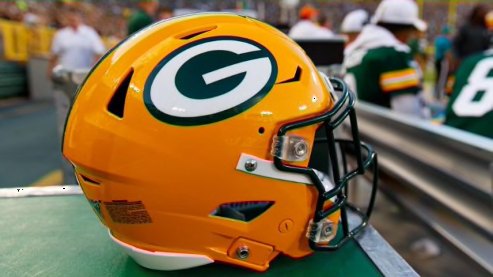
If there’s one aspect of the modern Packers uniforms that you’d consider the most iconic, it would be the “G” logo on the side of the helmets. So it definitely stands out that these 1950s classic throwbacks don’t have anything on the helmet — just a plain-colored dome with no stripe or logo.
While some fans might miss the “G” logo, this is the right type of change for a 1950s throwback. It makes the uniform kit stand out on its own in a major way and, with the minimalist design of the jersey and pants, it fits in perfectly with the rest of the look.
