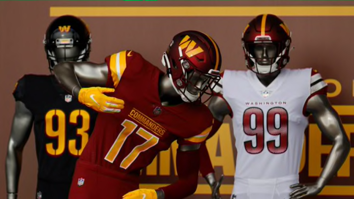
The Washington Commanders got their new name, logo, and uniforms. Let’s react and grade them all.
It’s been a few years of hype. Ever since they got rid of their old name, people have been wonder which direction Washington would go. The “Washington Football Team” is gone and we now officially have the “Washington Commanders”.
This was revealed to us on February 2. But how did the reveal go? Let’s take a look at the new team name, logo, and uniforms. We’ll react quickly to each and grade them all.
Washington Commanders logo, uniform, name reactions
Let’s start at the obvious spot here – the name. “Commanders” is pretty solid. I’ll be honest though, I didn’t really care about this part. As long as it wasn’t “Washington Football Club” or sticking with the “Football Team”, I was going to be happy. Those were too bland and I don’t think it would’ve attracted any new fans.
That being said, I think it’s a little silly to get worked up about a name. This might be slightly unpopular. But if you really care about the team name that much, you need to just relax a little bit. There’s no “oh but I have a connection to it” or whatever tired argument you’re going to make here. You have a connection to the team – not a name. It’s still the same franchise.
And honestly, they could’ve done a lot worse than the Washington Commanders. Not really all that flashy, but it makes sense for a team in the Nation’s Capital to have a name that has to do with military or history or something along those lines. So it was smart for them to go that route. I mean, they already were doing that in the MLB and the NHL.
It’s original and different.
Team Name Grade: B+
Washington Commanders new logo
One legacy. One unified future.
— Washington Commanders (@Commanders) February 2, 2022
We are the Washington Commanders #TakeCommand pic.twitter.com/Eav9NOV5Mm
The logo is pretty simple. It’s a form of the “W”. However, it is an updated and much more sleek-looking version. Nothing too flashy, but honestly I prefer that. It’s better to have a clean and simple logo than trying to do too much.
Remember when the Los Angeles Rams got clowned for releasing logos and the horn looked more like a lightning bolt and the one ram head looked like an … uhm … inappropriate body part.
This probably won’t win any awards for the best logo. But it’s really nice honestly. They didn’t try to do too much and still managed to make it look updated.
Team Logo Grade: B
Washington Commanders Jerseys
The future of Washington football is here #TakeCommand pic.twitter.com/MwkCLTkVAA
— Washington Commanders (@Commanders) February 2, 2022
Finally, we need to look at the jerseys. This one was simple for me, I absolutely loved them. Simple designs.
The white jerseys are nice, I like the sleeves and the numbers are pretty awesome. Big fan of the red jerseys too, the yellow numbers and “Commanders” over top of it look great. However, it’s the black jerseys that really caught my eye. The “Commanders” patch on the top right is phenomenal. The red outline on the yellow numbers is a nice touch as well.
As for the helmets, the red ones are great, nothing to complain about there. The black helmets are nice but the “W” on the front looks a little weird. Probably something we can all get accustomed to pretty quickly though.
Happy that they mainly kept the same color scheme but threw in some extra black because that always looks dope on a uni.
Really not much to be upset about here. Might be a higher grade than some were expecting but personally I love them.
Another important note to remember. Whenever teams release new jerseys, the internet loves to pretend like they are the worst thing ever. Then two years down the road 90% of those people are like “oh I actually really love those”. So don’t worry about all the people you’re going to see overreacting and acting like the Commanders now have the worst unis ever.
It’s an annoying tradition that will never go away.
Team Jersey Grade: A-
Overall the new name, logo, and jersey reveal went incredibly well. Everything looks good and the name choice might not be everyone’s favorite but it’s a lot better than some of the other options.
The “Washington Commanders” might take some getting used to for some people. But complaining isn’t going to change anything. Might as well get familiar with it. Personally, I’m a fan – so it’s easier for me to say that.
Overall Team Change Grade: B+
