NFL Uniforms: Grades for all 32 teams’ look in 2020
By Zach Cohen

AFC East
Buffalo Bills: B
They do a good job of balancing red and blue, which are generally contrasting colors. A nod to their franchise’s history secures some bonus points, too. Although, the curse of the gray facemask lives on, as I said in part three of this series:
"Sure, gray facemasks are a nod to the past, but there’s no reason for a random color to be in a team’s uniform. For example, the Bills have no gray anywhere in their logo nor the rest of their uniform."
More from NFL Spin Zone
- Dallas Cowboys made the trade everyone else should have made
- Pittsburgh Steelers rookie sleeper everyone should be talking about
- Anthony Richardson putting jaw-dropping talent on display immediately
- Denver Broncos’ stud wide receiver might be out for a while
- Washington Commanders: Three takeaways from win over Ravens
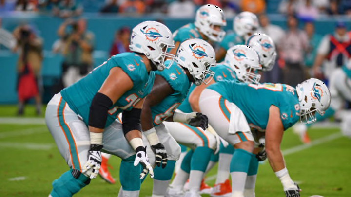
Miami Dolphins: B+
The main uniforms are sleek enough, but their throwbacks are a work of art. However, they mostly bring out what could be better in their main uniforms, like stripes and traditional number font. But this isn’t about what the outfits don’t have, it’s what they do have. And the Dolphins find solid middle ground between a modern look and a simple one. The aqua and orange blend nicely, while the white facemask pairs well with the helmet.
New York Jets: B
This look is a massive upgrade over their previous dreary look. The green has more color to it, and the Jets rightfully acknowledge it by giving their helmets a sparkled tint. Perhaps New York would get a higher grade if their color scheme was more diverse, but for what they have to work with, the franchise displays a fine gameday look. The all-black look is ambitious yet, depending on the lights the team plays under, usually looks good.
The look we love, promoted to primary.
— New England Patriots (@Patriots) April 20, 2020
Order now: https://t.co/SxB09Sfb9X pic.twitter.com/sfkUq81OUp
New England Patriots: C
New England unveiled their new look last month, and it’s just okay. The new white uniforms have some hurdles to cross, like the distracting red stripes on the shoulders. The navy home uniforms are a bit better, but the number font is still inconsistent with the rest of the look. At least the Patriots were smart to keep the red facemask. It’s a good complement to the lighter silver and darker navy of the outfit.